I’ve been wanting to try out Macaw and Reflow for
a while now. As a designer who doesn’t like coding, this is the
wizardry I’ve been waiting for! After messing around with both
applications the last couple of days, I was able to easily produce legit
looking web pages with pretty good looking code. Although the question
is – who did it better? Hit the jump for the answer, live demos, and
more!
I will preface that one should know a bit about CSS or HTML. I don’t know much, but basic knowledge is beneficial for better understanding of what the applications are doing. For example, understanding the difference between margin and padding. Basic knowledge is also useful for troubleshooting and code clean up.
Also, I’m a designer but this is a great tool for developers as well. The Reflow website states it is great for “high-fidelity prototypes.” When I think of prototyping, I think of static images or something created on InVision. This is much more than that, because you end up with something that you can move forward with. Not just great for prototypes but for landing pages and simple websites, or working code to be passed to back end developers.
Now let’s just jump into the nitty gritty. The websites I built were based on a Macaw tutorial I found on medium.com. Here are my live demos as well as some raw data. Before jumping in I should mention that Reflow is currently a Preview (aka beta).
In terms of raw data, Macaw wrote 30%
less lines of HTML and 34% less lines of CSS. As you can probably tell
from the live demos, they are both quite similar. So let’s look at a
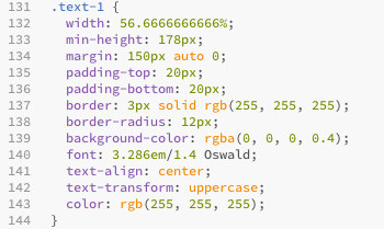
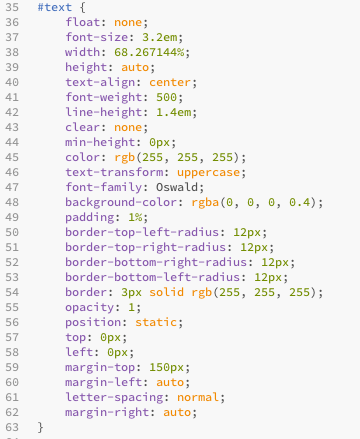
couple snippets of code and see what’s going on. I’m examining the
header.
So you can see how Macaw is doing a
much better job at using shorthand code. Even as one that is not as well
versed in code, I could notice simple things. For example, the border
radius in the CSS. Macaw wrote it as any dev would: as one line. Whereas Reflow does not yet seem to be as intuitive in compiling such lines and wrote 3 extra lines bloating the code.
I should also point out that multiple pages are consolidated in Macaw but remain as seperate entities in Reflow. So it seems as if developers won’t necessarily appreciate all the bloated code that Adobe is offering up, because it may very well be that the code produced may not save a developer any time.
How about the actual applications themselves? They are pretty identical. The only major difference (that I saw) is with Reflow, being an Adobe product, you’re able to import Photoshop files and create live assets – although I didn’t experiment with this feature.
Personally, from a designers perspective, Reflow seems more appealing because it is included with the Creative Cloud subscription and I believe is currently free. If I needed to create a landing page or simple website I wouldn’t go out of my way to purchase another product since I am already a Creative Cloud subscriber. In the end the visual output is the same albeit the code is bloated.
As for developers, those who don’t have Creative Cloud, or those who strive for cleaner code – Macaw is the way to go. Overall I feel as if the point of these applications is not just to be a prototyping tool but a new way of efficiently creating websites. For all intents and purposes…


0 comments: